10:40:57

Portfolio Piece

Category

Brand Identity

Duration

3 - 4 Weeks

Someone is drawing a logo on their tablet.

Northbound, a freight-tech startup building routing software for independent truckers

The Challenge

Northbound's early brand was a placeholder logo and no real visual system. They were raising a seed round and needed to look credible to both investors and truckers — two audiences with very different expectations

white freight truck on road during daytime

The Approach

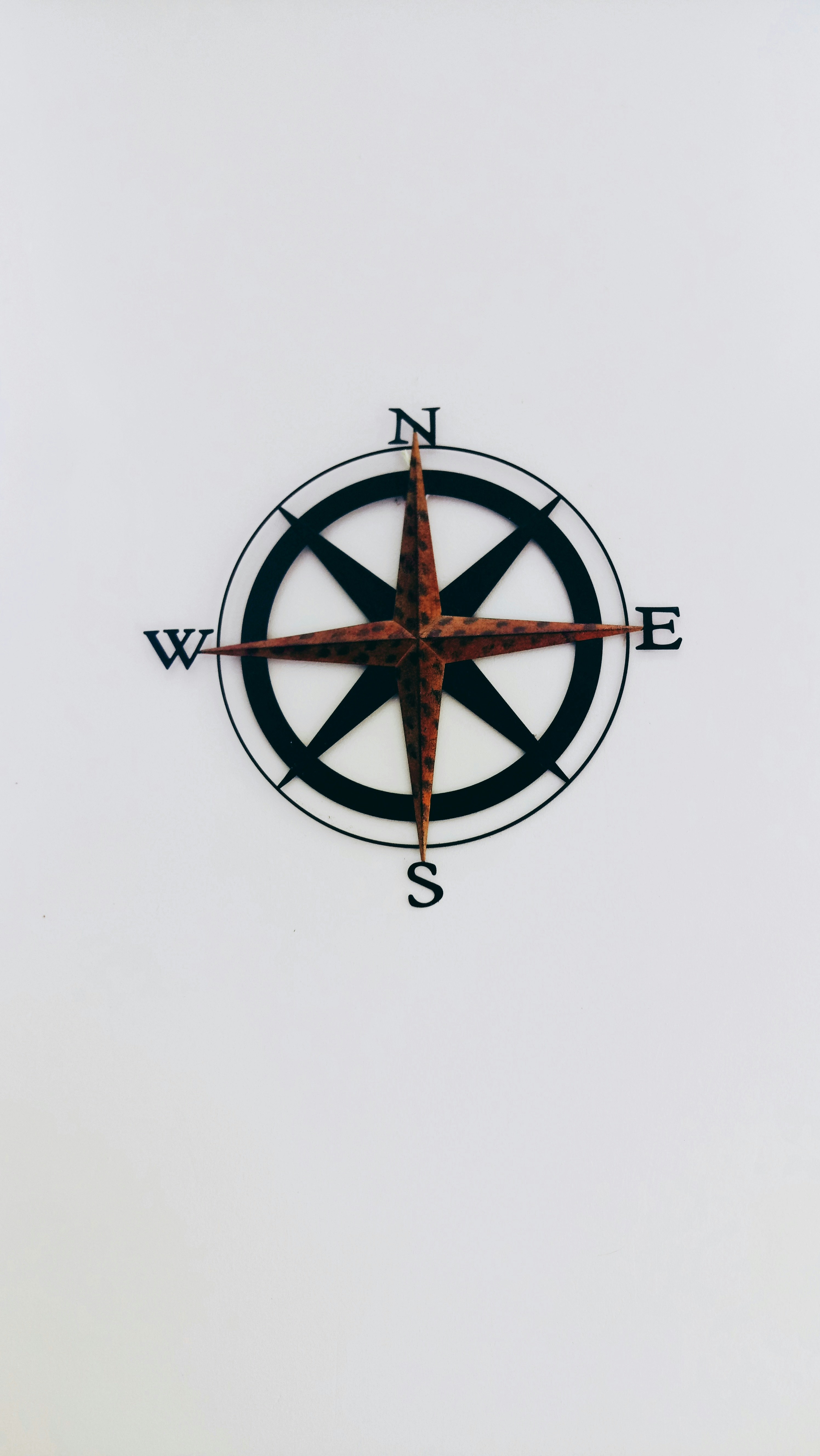
Built the identity around the idea of a "fixed point" — a mark that reads as a compass bearing at small sizes and a road marker at large ones. Chose a restrained navy-and-amber palette that felt industrial rather than "tech startup generic," paired with a geometric sans for digital and a heavier grotesk for physical applications like decals, which need to survive at a distance and in bad weather.

Results

0

investors who cited the brand as a factor in the raise

0

physical applications shipped at launch (decals, invoices, app icon)

0
%

redesign required across driver app, merch, and signage

0

core mark scaled across every application, no variants

Results

0

investors who cited the brand as a factor in the raise

0

physical applications shipped at launch (decals, invoices, app icon)

0
%

redesign required across driver app, merch, and signage

0

core mark scaled across every application, no variants

Results

0

investors who cited the brand as a factor in the raise

0

physical applications shipped at launch (decals, invoices, app icon)

0
%

redesign required across driver app, merch, and signage

0

core mark scaled across every application, no variants

north, east, west, and south wall decor
a truck on a road
a truck on a road

Create a free website with Framer, the website builder loved by startups, designers and agencies.